Every year Apple releases a new iPhone and a new iOS version to match. For the history of the iPhone, any changes that come with these new devices tend to be very small. Design changes in iOS7? Not a huge deal, as they’re fairly easy to design for, especially in a hybrid app context. This year however, Apple has introduce it’s most drastic change in iPhone history.
/cdn.vox-cdn.com/uploads/chorus_image/image/56641599/apple_iphone_2017_20170912_11670.0.jpeg)
Introducing… the Notch
This, is frustrating, to say the least, and from a hybrid app perspective, it introduces several new challenges.
1. Full screen support
First thing we’ll want to address is the high resolution of the iPhoneX. This is not an entirely new issue, and iPad Pro also has a large resolution. With this high resolution, we need to provide a larger splashscreen image, but in a slightly different way then we’re used to. In Cordova-ios 4.3.1, there was support added for something called “Launch Storyboards”. Essentially, we can tell iOS that we’re providing a large image, and it will properly scale and crop it to fit our screen. I’ll be using an Ionic project as an example, but this is not tied to Ionic. In our resouces folder, we’ll add an image that is 2732x2732px in size. We’ll add this as resources/ios/splash/Default@2x~universal~anyany.png. Then, in our config.xml, we’ll add a new reference to the image.
<platform name="ios">
  <allow-intent href="itms:*" />
  <allow-intent href="itms-apps:*" />
  <splash src="resources/ios/splash/Default@2x~universal~anyany.png" />
</platform>
The Ionic CLI has been updated to generate this image for you
When we build our app and deploy to iPhoneX simulator, we should get something similar to this.
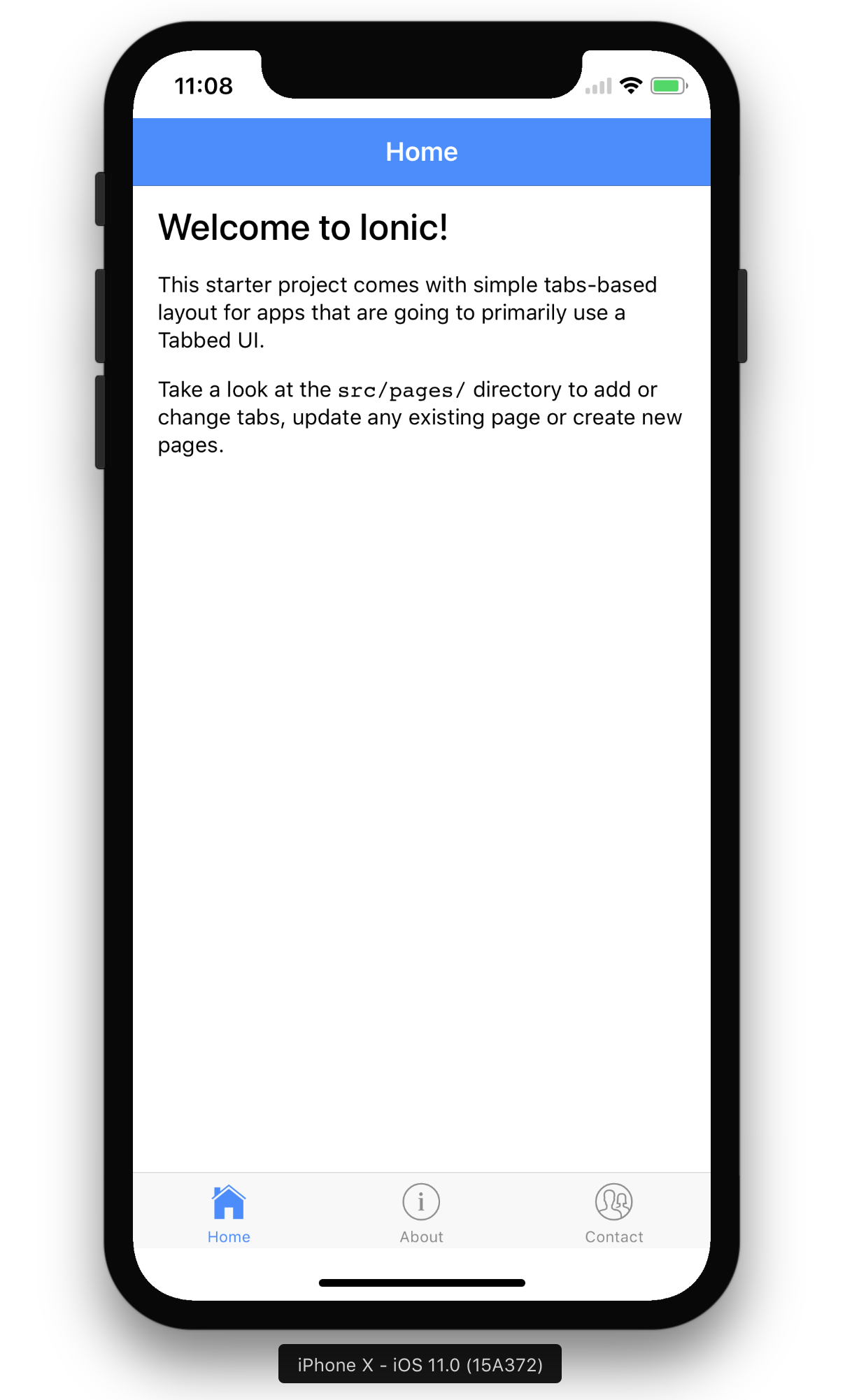
This is a good first step so far, but you’ll notice we’re still not using all of the screen, we have some space at the bottom and top of the device.
2. Adjusting the viewport
The next piece we need to add is a small change to our viewport meta tag. By default, Ionic projects come with a viewport meta tag that looks like this:
<head>
  <meta name="viewport" content="width=device-width, initial-scale=1.0, minimum-scale=1.0, maximum-scale=1.0, user-scalable=no">
</head>
This has served us well for many years, but now we need to add a new entry, viewport-fit. This new entry can tell a browser how it should scale/size it self. It can take 3 values.
| Value | Description |
|---|---|
cover | The viewport will scale to fill the entire screen, regardless of aspect ratio. Think css background-images |
contain | The viewport will scale until it hits an edge. This could be the sides of the screen, or top and bottom |
There is a default auto value as well, but it is the same thing as contain.
We want to add cover to our viewport meta tag.
<head>
  <meta name="viewport" content="width=device-width, initial-scale=1.0, minimum-scale=1.0, maximum-scale=1.0, user-scalable=no, viewport-fit=cover">
</head>
3. CSS Changes
For the last pieces of changes is centered around CSS changes, and really depends on your framework. But the concepts will be centered around a new safe-area margins that are available in iOS11 and Webkit. The Webkit team wrote a great post about the safe-area insets and how you can use them. We at Ionic are in the process of updating our styles to take advantage of these as well. This can be a tedious process are requires careful planing/design changes in order to work with the new form factor.
This will definitely be the more difficult part as it is really up to how you made your app. It could just a framework update, like it will be with Ionic, or lots of changes to your own CSS.
Parting words
Overall, there are only 3 concepts/new features to take care of the new iPhoneX form factor. The Viewport and the splashscreen image really are straightforward, but the CSS changes will because confusing as time goes one. Good Luck!